
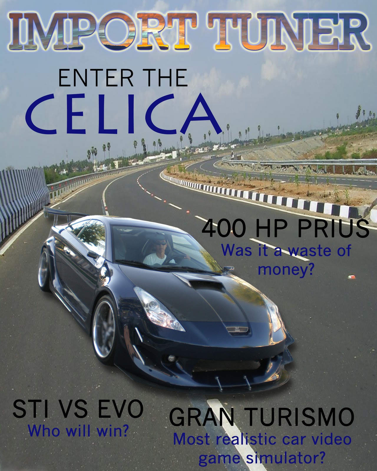
For my project on making a magazine cover, I chose my subject or theme to be about cars. The reason why I chose this is because ever since I can remember, I have always loved everything about cars. All of my inspiration has come from this love of cars, and even though at many times I had encountered a lot of problems and the easiest thing to do was to switch my subject, I kept on persevering. I chose to base my magazine on another car magazine called Sport Compact Car. This magazine cover sample is a perfect template because it does a great job giving emphasis to the main article, but it also includes the subheadings in a fashion that doesn't distract you from the main article.
I incorporated many different principles of design in making my magazine cover. I had a somewhat radial balance, with my subject in the middle and the subheadings circling around it. My rhythm was created by the repetition of a blue color that is similar to the dark metallic blue paint on the car. This repetition was seen in the main heading, as well as the sub headings and reflected in the background I chose for the clipping mask and outer glow on the main title. This rhythm gave my magazine cover a sense of unity in the fact that I took something that was very apparent on the main subject, which was the color, and repeated it through out the design. The blurring of the wheels gave it the effect that the car is moving, giving my magazine cover movement. The main emphasis of this magazine cover is obviously the car. I wanted to give the car dominance over everything else because of the fact that it is the subject and that I thought it would be something the viewer would enjoy since it is beautiful.
I gave this magazine cover an overall light value. I used black to contrast the blue in the subheadings, which allowed the magazine cover to refrain from becoming monotonous. The shape of the car is both organic and geometrical. Most of the body has curved lines, while in the front bumper there are triangular shaped objects.
The first thing I did to the original photo was crop out the picture using the quick selection tool, and then went in further by adding a mask on it and brushing away the pixels of the original background. Then, after finally finding the perfect background, I placed the car in and added a drop shadow that was appropriate. After that, I made a new-copied layer and blurred the rims to give it the feel that the car was in movement. To make it easier to move the car around, I merged the two layers together into one. I used a background with a sunset and used it as a clipping mask for the title of the magazine cover. Then, I added an outer glow on it with the colors reflecting the blue of the car and the color of the title. Lastly, I created a color that I liked and that matched the color of the car and added it to my swatches, and then used that color on the subheadings to give the art piece unity.
